Panmure Gordon
London’s oldest stockbroker, Panmure Gordon came to Rooster for a rebrand to bring back some of the brand equity and heritage they felt they had lost in previous years. We knew this project required a traditional influence, and while we took inspiration from the brand’s origin, we still believed it was important to add an element of modernity to ensure longevity.

Back to the beginning
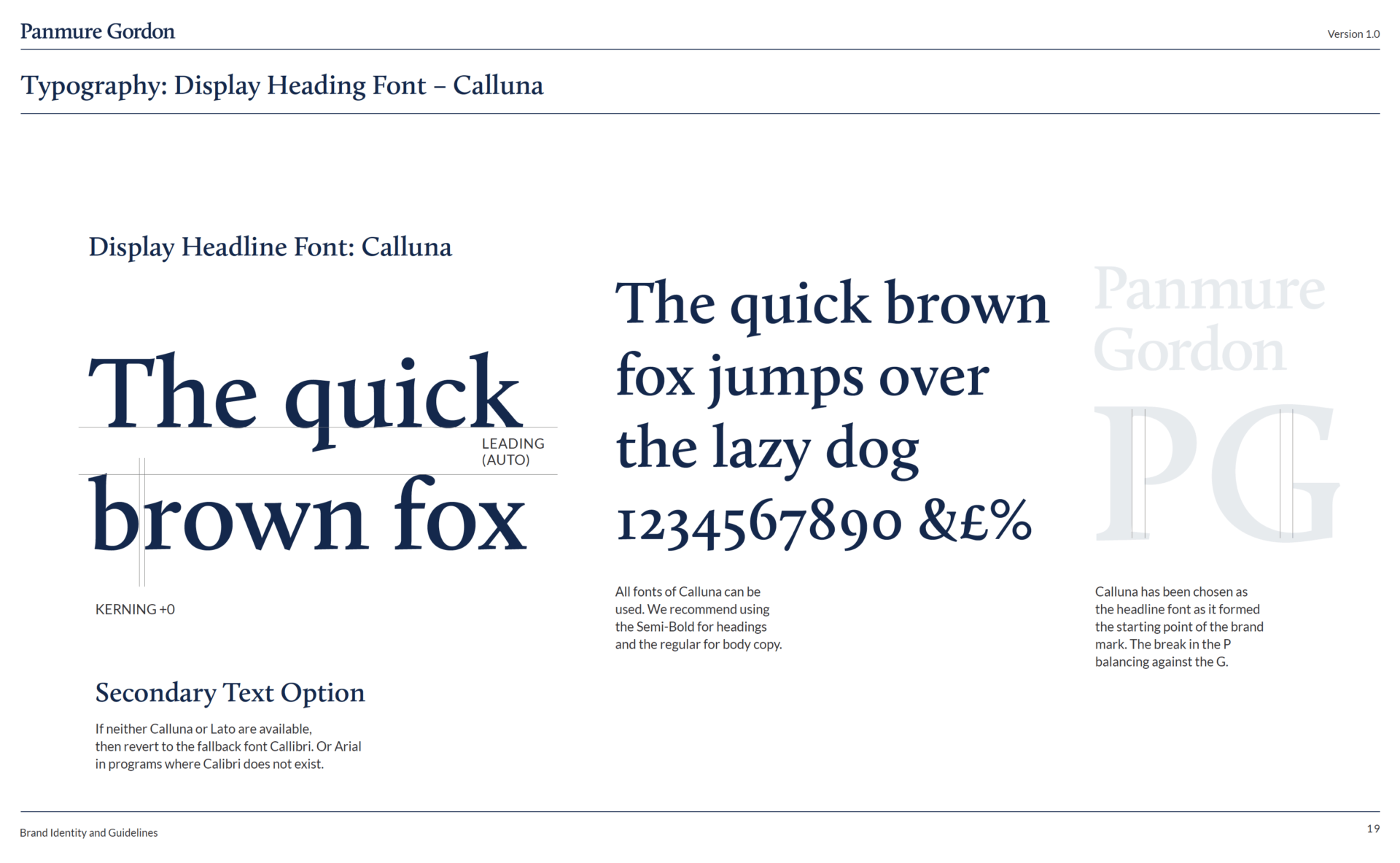
We took a close look at the history of Panmure Gordon and reinforced some of the legacies that had been left behind. The team began in-depth brand research, dissecting every evolution of the logo to extract the core essence of the brand’s originality. From this, we eventually settled on a simple, yet classic Serif-based logo that was inspired by a combination of the historic Panmure logos.


Bold solid navy and well-proportioned layouts are all at the core of the Panmure Gordon 2023 rebrand
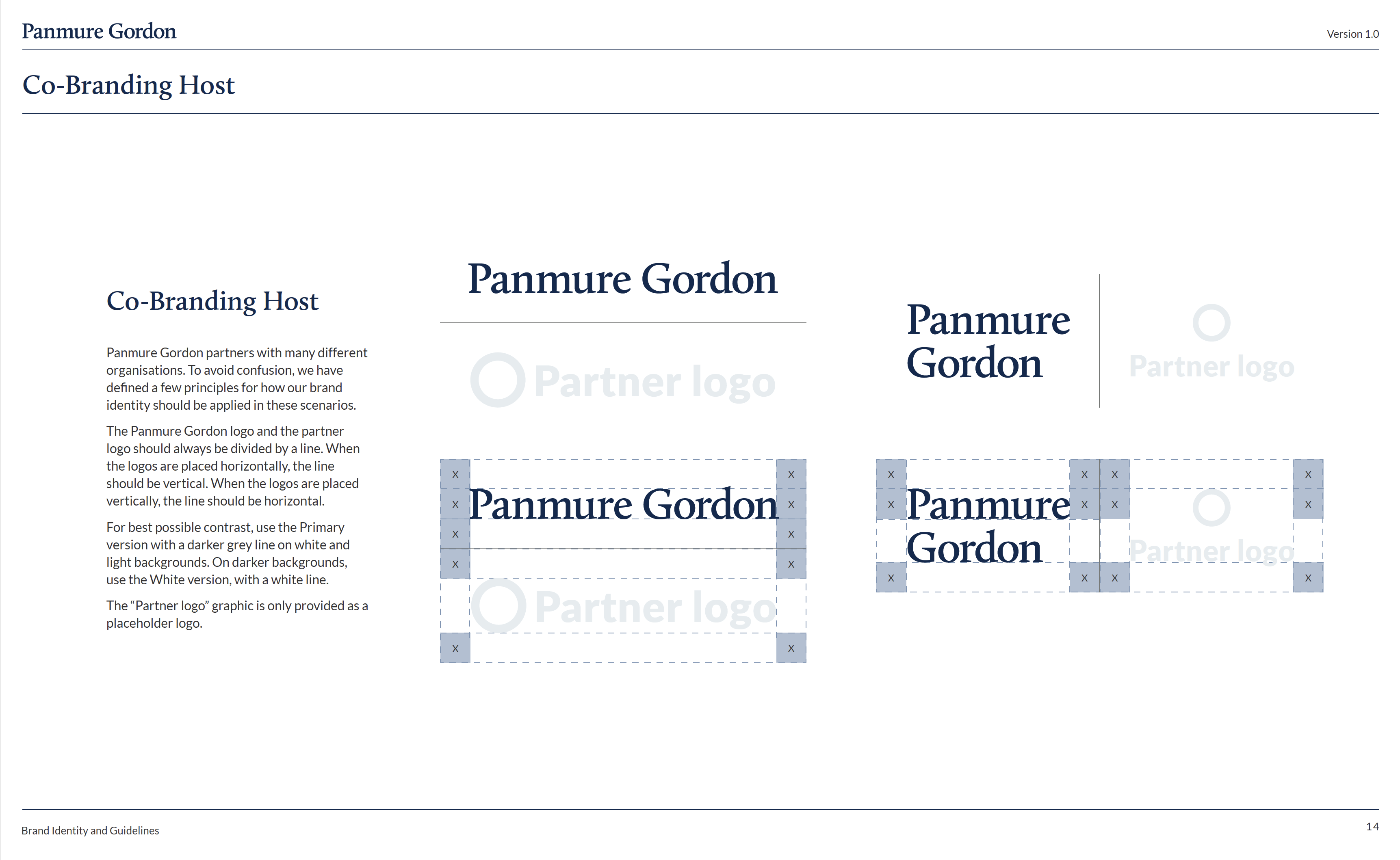
A seemingly simple heritage mark elevated the brand. After establishing the logo, we rolled out a full branding exercise which included all branding collateral and guidelines, leaving Panmure Gordon with an understated, elegant representation of the business that oozes an abundance of confidence.


